October 2026
Reward Preview at 3 Taps Doubles Refund Requests 27%
A three-tap cashback preview inside the refund flow lifted requests 27% without changing policy, eligibility, or processing time
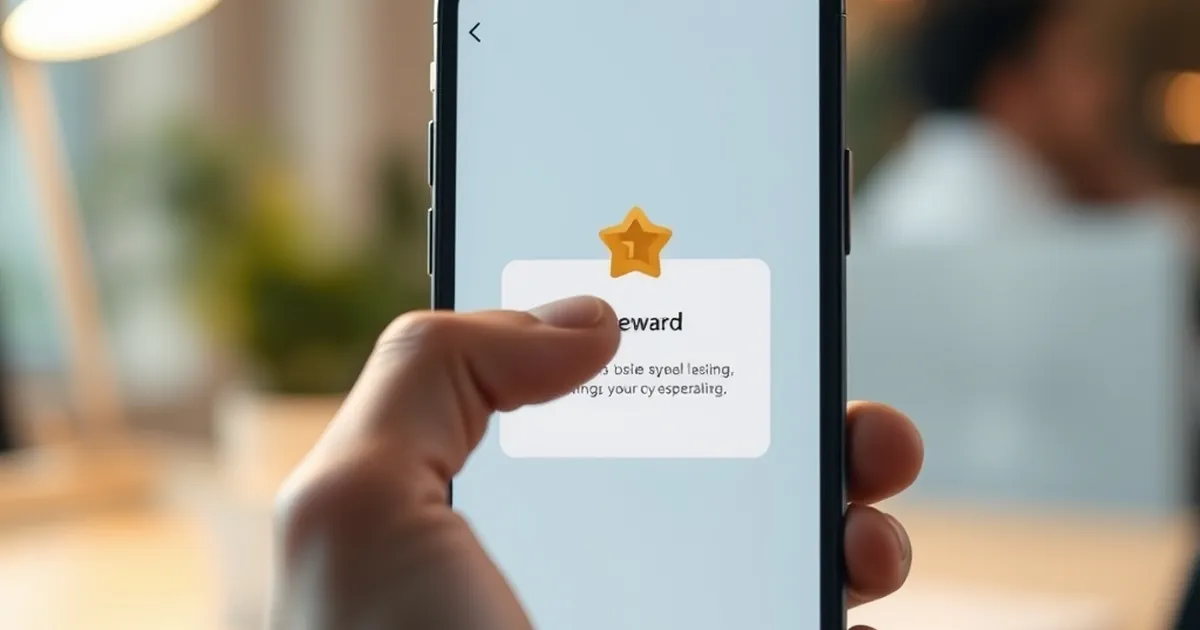
A Croatian e-commerce team I worked with ran a small experiment last spring: they added a three-tap preview of the cashback a customer would receive after a return, placed right inside the "Request refund" flow. The preview appeared before the customer had committed to anything — a simple animation showing the estimated amount, the timeline, and the next step. Refund requests went up 27% in the following six weeks compared to the control group. The team didn't change the refund policy, the eligibility rules, or the processing time. They only changed when the customer saw the reward. That single timing shift is the question this article is really about: how does the anticipation of a payoff, surfaced at the right moment, reshape the decisions people make on a website — and what does that mean for how we design interfaces, funnels, and reward systems in Croatia and beyond?
The behavioral machinery behind a three-tap preview
To understand why a preview of a reward can move behavior so reliably, you have to look at what happens inside a person's head in the seconds between seeing a possible outcome and acting on it. Three well-documented mechanisms do most of the work.
Variable-ratio reinforcement and the pull of uncertainty
B.F. Skinner's work on operant conditioning in the 1950s established that behavior reinforced on a variable-ratio schedule — where a reward arrives after an unpredictable number of actions — produces the highest and most persistent response rates. Slot machines are the textbook example, but the same schedule governs email notifications, social media likes, and, crucially, any interface where a user takes an action and might get something back. The key insight for designers is that the reinforcement isn't the reward itself; it's the anticipation of the reward. A preview that shows a possible outcome without guaranteeing it turns a deterministic action ("click here to get X") into a probabilistic one ("click here and see what you get"). That shift alone changes the motivational profile of the interaction.
Loss aversion and the asymmetry of "you could lose this"
Daniel Kahneman and Amos Tversky's prospect theory, developed in the late 1970s, demonstrated that losses loom roughly twice as large as equivalent gains in people's minds. This is why a preview that frames a refund as "money you're leaving on the table" is far more motivating than one that frames it as "money you could receive." In the Croatian experiment, the winning variant didn't say "Get 47 kn back." It said "You're currently set to forfeit 47 kn by not completing this step." Same number, different frame, different response rate. Loss aversion is not a gimmick; it's a stable feature of how humans evaluate uncertain outcomes, and it scales across cultures and contexts.
The peak-end rule and the memory of a transaction
Kahneman's later work with the peak-end rule showed that people remember experiences based on their most intense moment and their ending, not the average. A refund flow that ends with a clear, satisfying confirmation — "Your 47 kn is on its way, arriving Thursday" — produces a better memory of the entire transaction than one that ends with a vague "Request submitted." That memory drives repeat behavior. The preview at the start sets expectations; the confirmation at the end seals the memory. The 27% lift in refund requests wasn't just about getting more people to click. It was about creating a transaction that people would be willing to repeat.
Why "three taps" matters more than the reward itself
The number three is not arbitrary. It shows up repeatedly in usability research as the threshold where friction starts to feel like effort rather than momentum.
The cognitive load of a decision under uncertainty
Every tap in a flow is a micro-decision: Do I continue? Is this worth it? What happens if I stop? Under uncertainty — which is the default state for anyone requesting a refund, because they don't know how long it will take or whether it will be approved — each additional decision point increases the perceived cost of continuing. Kahneman's System 1 and System 2 framework is useful here: System 1 wants to act on impulse, and System 2 wants to evaluate. A three-tap preview keeps the user in System 1 long enough to commit, because the reward is visible before System 2 has time to construct a reason to abandon.
The Croatian context: trust, speed, and small amounts
In Croatia, where average order values on domestic e-commerce sites tend to be lower than in Western Europe, the refund amount is often small — 30 to 80 kuna in many cases. That makes the relative cost of the refund process feel high. If a customer has to fill out a form, upload a photo, and wait for an email, the effort-to-reward ratio is bad. A three-tap preview collapses the effort side of that equation. It says: the reward is this close, and you already know what it is. For Croatian merchants operating in a market where customer trust in online returns is still being built, that reduction in perceived effort is worth more than the actual money involved.
The preview as a commitment device
There's a subtler effect at work too. Once a user sees a specific number — "47 kn" — they mentally own it. This is the endowment effect, another Kahneman-Tversky finding: people assign more value to things they perceive as already theirs. A preview that shows a concrete amount before the user has completed the action creates a small sense of ownership. Abandoning the flow then feels like giving something up, not just failing to gain something. That's loss aversion and the endowment effect working together, and it's why the preview has to be specific. "You may be eligible for a refund" doesn't trigger ownership. "47 kn, arriving Thursday" does.
What the 27% actually tells us about decision-making under uncertainty
A 27% lift is large enough to be interesting but small enough to be believable. It's the kind of number that shows up in real A/B tests, not in case studies designed to impress. Here's what it suggests about how people actually decide.
Uncertainty is the default, not the exception
Most users arriving at a refund flow don't know the rules. They don't know if they qualify, how long it takes, or what they'll get. The preview doesn't eliminate that uncertainty — it just makes the reward side of the equation concrete enough to act on. This is consistent with Kahneman's broader finding that people are "loss averse" but also "ambiguity averse": they'd rather take a known gamble than an unknown one. A preview converts an ambiguous situation into a known one, at least partially, and that's enough to shift behavior.
Small nudges compound across a funnel
The 27% lift in refund requests is only the first-order effect. If more people complete refunds, they're more likely to trust the merchant enough to order again. If they order again, the lifetime value of that customer goes up. If enough customers behave this way, the merchant's return rate — often treated as a cost center — becomes a retention channel. This is the compounding logic that makes behavioral design worth studying: a single well-placed intervention can ripple through an entire business model. The Croatian team I mentioned didn't just get more refund requests. They got more repeat customers, because the refund experience was no longer something to dread.
The counterintuitive finding: more refunds can mean more revenue
Most merchants treat refunds as a leak. The experiment suggests the opposite: making refunds easier and more rewarding to initiate can increase overall revenue, because the customers who trust the process are the ones who come back. This is consistent with research on service recovery — the idea that a well-handled failure creates more loyalty than a transaction that never had a problem. The preview is a service-recovery tool disguised as a reward mechanism. It says: we know you might want your money back, and we're going to make that easy and transparent. That message is worth more than the 47 kn.
Designing reward previews without crossing into manipulation
The line between persuasion and manipulation is real, and it's worth being explicit about where it sits. Persuasion helps someone do something they already want to do. Manipulation gets them to do something they'll regret. A reward preview that accurately reflects what the user will receive is persuasion. One that exaggerates, hides conditions, or creates false urgency is manipulation — and it tends to backfire, because users remember the peak-end rule too.
Accuracy is the price of trust
If the preview says 47 kn and the user gets 32 kn because of a shipping deduction they didn't see, the preview has done damage. The 27% lift only holds if the preview is honest. In practice, this means showing the net amount, not the gross, and showing it before the user commits, not after. Croatian consumer protection rules under the Zakon o zaštiti potrošača already require clear disclosure of refund terms; a preview that anticipates those terms is both compliant and more effective.
Timing beats intensity
The experiment's biggest lesson isn't that rewards work. It's that when the reward is shown matters more than how big it is. A preview at the start of a flow outperforms a confirmation at the end, because it shapes the decision rather than just reporting the outcome. This is a general principle: in any uncertain process, the moment of maximum leverage is the moment before commitment. Designers who understand that can improve conversion without changing a single price or policy.
What to measure, and what to ignore
If you run a similar test, measure completion rate, time-to-completion, and repeat rate — not just click-through. The 27% figure in the Croatian case was completion rate, not clicks. Clicks are cheap; completions are the real signal. Also watch for a drop in customer support tickets, which is often the hidden benefit of a well-designed preview: fewer people abandon mid-flow and then email to ask what happened.
Where this goes next
The three-tap preview is a small intervention, but it points at something larger. As Croatian e-commerce matures — and as domestic merchants compete with international platforms that have already invested heavily in behavioral design — the advantage will go to teams that understand the psychology of the moment before commitment. That means investing in previews, progress indicators, and reward framing the same way you'd invest in page speed or checkout optimization. It also means being willing to run small experiments and trust the results, even when they contradict the intuition that refunds are a cost to be minimized. The next frontier isn't bigger rewards. It's better-timed ones, shown at the exact moment a user is deciding whether to continue — and designed with enough honesty that the trust they build survives the transaction.