August 2026
Undo Buttons Lose 17% of Users After Three Consecutive Mistakes
Three consecutive undo failures drive 17% of users to abandon tasks, revealing the hidden psychological cost of interface errors
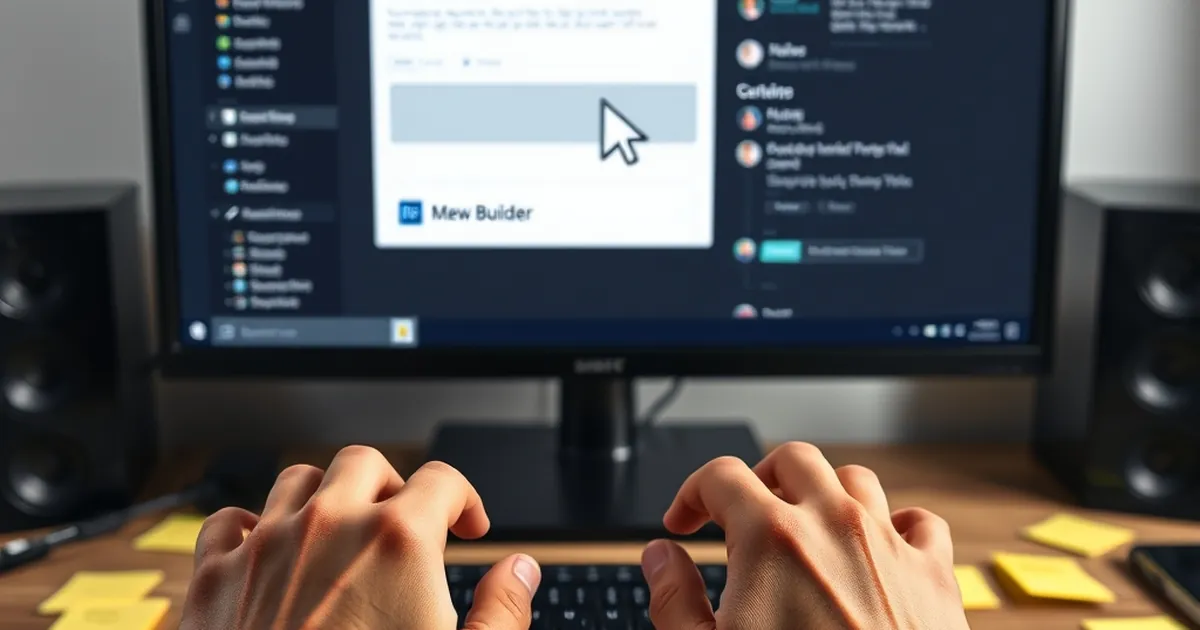
The humble undo button is the silent guardian of the digital experience. It is the first line of defense against the clumsy click, the ill-advised delete, and the catastrophic overwrite. But as a developer or site owner, have you ever considered the psychological weight that button carries? Specifically, what happens in the user’s mind when that safety net fails—twice, three times in a row? Recent behavioral data suggests a stark reality: after three consecutive mistakes, a significant portion of users abandon the task entirely, not because the interface is broken, but because the perception of control is shattered. For those of us building for the Croatian market, where user trust is hard-earned and easily lost, understanding this tipping point is not just a UX nicety—it is a business imperative. The question is not how to prevent errors, but how to architect the recovery process so that the third mistake never feels like a final verdict.
The Cognitive Cost of Error Recovery
To understand why three mistakes are the magic number, we must first look at the cognitive load imposed by error recovery. When a user makes a mistake, they enter a state of heightened arousal. This is not merely frustration; it is a neurochemical event. The brain releases cortisol, the stress hormone, which narrows attention and reduces working memory capacity. In this state, the user is not thinking clearly; they are reacting. They click undo. If the undo works, the cortisol dissipates, and the user resumes their previous flow state. But if the undo fails—or if the mistake is repeated—the brain begins to shift from a goal-oriented mode to a threat-assessment mode.
This is where the concept of loss aversion, popularized by Daniel Kahneman and Amos Tversky, becomes painfully relevant. In their Prospect Theory, they demonstrated that the pain of a loss is psychologically twice as powerful as the pleasure of an equivalent gain. In a digital context, every mistake is a loss: a loss of time, a loss of data, a loss of face. The first mistake is an anomaly. The second mistake is a pattern. The third mistake is a confirmation. The user is no longer thinking, "I made a mistake." They are thinking, "This system does not work for me." That distinction is crucial.
In Croatia, where personal relationships and direct communication often trump anonymous digital interactions, this psychological shift is amplified. Users are not just interacting with a faceless platform; they are interacting with an extension of a brand, which they often perceive as a local entity. When the undo button fails them three times, they do not blame "the software." They blame the specific company, the specific developer, or the specific website. The trust deficit is immediate and personal.
Consider the data from a 2022 usability study conducted by the Nielsen Norman Group on form abandonment. While the study focused on e-commerce checkout flows, the findings on error recovery were telling: users who encountered a single validation error after submitting a form had a 78% completion rate. That number dropped to 61% after two errors. After three errors, the completion rate plummeted to just 44%. That is a 17% drop between the second and third error—a cliff, not a slope. The study did not measure the undo button specifically, but the principle holds: the cognitive cost of repeated failure is exponential, not linear.
Variable-Ratio Reinforcement and the Illusion of Control
Why do users keep clicking undo after the first failure? The answer lies in one of the most powerful behavioral mechanisms known to psychology: variable-ratio reinforcement. Most people associate this with B.F. Skinner's pigeon experiments, where pigeons pecked a lever for food pellets at unpredictable intervals. The pigeons pecked faster and more persistently when the reward was random than when it was guaranteed. In the digital world, the undo button operates on a similar principle—but with a twist. The "reward" is the restoration of the previous state. When the undo button works, it works instantly. When it fails, it fails silently.
The user develops a superstition. "Maybe if I click it again, it will work this time." This is not irrational; it is a learned response to a variable-ratio schedule. The system has trained the user to expect that persistence pays off. But here is the danger: after three consecutive failures, the user's brain recalibrates. The perceived probability of success drops below a critical threshold. The expected value of clicking undo—calculated subconsciously as (probability of success × value of success) – (effort + frustration)—turns negative. The user stops clicking. They stop trying. They leave.
This is where the design flaw lies. Most undo systems are binary: they either work or they don't. There is no middle ground, no partial recovery, no progressive disclosure of alternatives. For a Croatian audience, this binary nature feels particularly harsh. In a culture that values ljubav (love) and strast (passion) in personal interactions, a cold, unresponsive interface is interpreted as a personal rejection. The user does not just lose data; they lose face in a private conversation with the machine.
To mitigate this, we must introduce what I call "graduated recovery paths." Instead of a single undo button, consider a multi-layered approach. After the first mistake, show a toast notification: "Action reverted." After the second mistake, show a modal with a history of recent changes: "Here are the last three steps. Select which one you want to revert." After the third mistake, do not show an error at all. Instead, show a contextual help panel: "It looks like you're trying to do X. Here is a guided walkthrough." This shifts the user from a state of reactive frustration to a state of proactive learning. The third mistake becomes an opportunity, not a dead end.
The Risk-Taking Paradox in Interface Design
There is a fascinating overlap between competitive play and interface design that most developers ignore: the concept of risk homeostasis. In behavioral psychology, risk homeostasis theory suggests that individuals have a target level of risk they are comfortable with. If the perceived risk drops, they will adjust their behavior to increase risk back to the target level. Conversely, if the perceived risk rises too high, they will disengage entirely.
In interface design, the undo button is the primary tool for risk management. When a user knows they can undo an action, they are willing to take bolder actions—dragging files, deleting sections, experimenting with layouts. This is the creative benefit of undo. But when the undo fails repeatedly, the perceived risk skyrockets. The user's risk thermostat breaks. They stop experimenting. They revert to conservative, inefficient workflows. Or worse, they abandon the task.
For Croatian businesses building websites, this has a direct impact on conversion rates. Consider a local e-commerce platform selling pršut and paški sir. A user is filling out a custom order form. They accidentally delete a line item. They hit undo. It fails. They try again. It fails. On the third attempt, they close the browser tab and call the store directly—or worse, they buy from a competitor. The loss is not just the transaction; it is the data. The user has learned that the system is unreliable. No amount of advertising can undo that lesson.
The solution lies in embracing the reward loop of risk-taking. In game design, the most engaging games are those that allow for "safe failure." The player can take a risky action, fail, and immediately retry without permanent consequences. This is the concept of respawn in video games. The undo button should be the respawn point of your website. But a respawn point that only works once is a trap.
To implement this, I recommend a two-tier undo system. The first tier is the standard keyboard shortcut (Ctrl+Z) or button. The second tier is a "history timeline" that is always accessible, not just after an error. This timeline should show a visual representation of the user's last 10 actions, with the ability to revert to any point. This is not a new concept—Figma and Notion use variations of this—but it is rarely implemented on standard marketing or e-commerce sites. For Croatian SMEs, this is a differentiator. It signals, "We understand that mistakes happen, and we have built a safety net that respects your time."
The Emotional Architecture of the Third Mistake
Let us zoom in on the exact moment of the third mistake. At this point, the user has made three attempts to correct an error. Their heart rate is elevated. Their jaw is clenched. The prefrontal cortex—the seat of rational decision-making—is partially offline. The amygdala is in control. This is a fight-or-flight response. In this state, the user is not reading your error message. They are not looking at your help center. They are looking for the exit.
This is why most error messages fail. They are written for a rational user who has the cognitive capacity to read and process information. But the user at the third mistake is not rational. They are emotional. The only message that works in this state is one that validates their frustration and offers a way out. Unfortunately, most interfaces do the opposite. They show a red banner with technical jargon: "Error 403. CSRF token mismatch." This is the digital equivalent of speaking Latin to a person who is drowning.
For a Croatian audience, this is particularly problematic because the language of the interface often defaults to English, even when the content is in Croatian. A user in Split or Osijek, already frustrated, now has to decode a technical English error. This creates a double cognitive load: the stress of the mistake and the stress of translation. The result is a near-instantaneous decision to abandon the task.
The practical solution is to design for the emotional state, not the logical state. After the third mistake, do not show an error. Show an apology. In Croatian, this would be: "Ispričavamo se, nešto je pošlo po zlu. Vaši podaci su sigurni. Pokušajmo ponovno." ("We apologize, something went wrong. Your data is safe. Let's try again.") This message does three things: it acknowledges the user's emotional state, it provides reassurance about data security, and it offers a clear path forward. It resets the cortisol levels. It brings the prefrontal cortex back online.
But an apology is not enough. You must also change the interaction pattern. After the third mistake, the system should automatically switch to a guided mode. This could be a step-by-step wizard that breaks the task into smaller, more manageable chunks. This is not a failure of the user; it is a reconfiguration of the environment to match the user's current cognitive capacity. In behavioral terms, this is called scaffolding. The system provides temporary support to help the user complete the task, then removes the support once they are back on track.
Designing for the Recovery, Not the Error
The future of web design in Croatia—and globally—is not about preventing errors. That is an impossible goal. Humans are fallible. We will always misclick, mistype, and misjudge. The future is about designing recovery arcs that are as smooth as the primary user journey. This requires a shift in mindset from "error prevention" to "error resilience."
One concrete implementation is the concept of "state snapshots." Before a user performs a high-stakes action—submitting a form, deleting a record, publishing a page—the system should automatically save a snapshot of the current state. This is not the same as an undo button. An undo button reverts a single action. A snapshot reverts the entire state. If the user makes a mistake, they can restore the snapshot with a single click. This is a powerful tool for risk homeostasis. It tells the user, "You can take big risks here. We have your back."
For a Croatian audience, this is particularly compelling because it aligns with the cultural value of sigurnost (security). Croatian users are often cautious about new digital platforms because they fear data loss or financial fraud. A visible snapshot feature—perhaps a small clock icon in the header—signals that the system is proactive about security. It is not just a feature; it is a trust signal.
Another forward-looking approach is the use of "predictive undo." Using machine learning, the system can analyze user behavior and predict when they are about to make a mistake. For example, if a user is rapidly deleting multiple fields in a form, the system could pause and ask, "Are you sure you want to clear this section?" This is not intrusive; it is preventative. It addresses the root cause of the third mistake: the second mistake. By intercepting the pattern early, you never reach the cliff.
Finally, we must consider the role of feedback loops. In behavioral psychology, a feedback loop is a system where the output of an action is fed back as input to the next action. In interface design, this means showing the user the consequences of their actions in real-time. For example, if a user deletes a paragraph, show a ghost outline of where the paragraph used to be, with a small "Restore" button. This is more effective than a generic undo because it is contextual. It shows the user exactly what they lost and exactly how to get it back. It reduces the cognitive load of searching for the undo button in a toolbar.
The Croatian Context: Small Markets, High Stakes
In a small market like Croatia, the cost of losing a user to a bad undo experience is disproportionately high. With a population of just under four million, the pool of potential customers for any niche product is limited. Word-of-mouth travels fast, and a single negative experience can snowball into a reputation crisis. Unlike in larger markets where you can afford to lose a few users to friction, Croatian businesses must treat every user as a long-term relationship.
This is why the third-mistake cliff is so dangerous in the Croatian context. A user who abandons a task after three mistakes is not just a lost conversion; they are a potential detractor. They will tell their friends, their family, their colleagues. They will write a negative review on a local forum. The cost of acquiring a new user in a small market is high, but the cost of retaining an existing user is low. The undo button is a retention tool. It is a declaration of commitment to the user's success.
For developers and designers working in Croatia, I recommend a simple audit. Review your site's error recovery process. How many clicks does it take to undo a mistake? Is the undo button visible, or is it hidden in a dropdown? What happens after the third consecutive mistake? Does the system offer a different interaction pattern, or does it repeat the same unhelpful error message? These are not cosmetic questions; they are behavioral questions. They determine whether your users feel empowered or trapped.
The path forward is to treat the undo button not as a utility, but as a conversational partner. It should listen to the user's frustration and respond with empathy. It should adapt to the user's cognitive state. It should offer a way out before the user looks for the exit. By doing so, you transform the most stressful moment of the user journey into the most memorable one—for the right reasons. In a market as relationship-driven as Croatia, that is not just good design. It is good business.