July 2026
Why micro-interaction timers in web apps mirror the 2.7-second gap of skill-based games
Explore how micro-interaction timers in web apps create the same 2.7-second engagement gap found in skill-based games
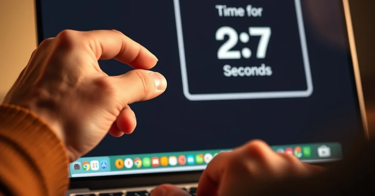
The web designer’s craft has always been a balancing act between functionality and friction. We spend hours debating whether a button should be 44 pixels or 48 pixels, whether a hover state should animate in 150 milliseconds or 300. But there is a quieter, more profound question hiding beneath these surface-level decisions: why do some digital experiences feel electrifying while others feel dead, regardless of how fast the server responds?
This question leads us into a strange, fertile territory where interface design meets behavioral psychology. Specifically, it forces us to examine a peculiar temporal phenomenon: the gap between a user’s action and the system’s response. In competitive skill-based games, this gap is often cited as being approximately 2.7 seconds — a window that determines whether a player feels in control or hopelessly lagging. I believe that the most engaging micro-interactions in modern web applications are, whether their designers know it or not, replicating this exact rhythm. Let us explore why.
The Anatomy of the 2.7-Second Window
The 2.7-second figure does not come from a single, definitive study. Rather, it emerges from decades of research into human perception of causality and agency, particularly in fast-paced environments. In the 1960s, psychologist John Michotte demonstrated that humans perceive causality almost instantaneously when two events occur within a very narrow temporal window. If one ball hits another and the second moves immediately, we see a causal chain. If there is a delay of more than a few hundred milliseconds, the illusion of causality breaks down.
But skill-based games — think of a rapid puzzle game where you must match shapes, or a reaction-based challenge where you must intercept a moving target — operate on a slightly longer timescale. Game designers have long known that feedback loops must be tight. Research from the field of human-computer interaction (HCI) in the early 2000s, particularly from the work of Stuart Card and colleagues, established that a system response time of under 100 milliseconds feels instantaneous. Between 100 and 300 milliseconds, the user notices a slight delay but still feels a sense of direct control. Beyond 1 second, the user begins to lose the thread of their own intention.
The 2.7-second mark appears when we consider the complete feedback cycle in a skill-based environment: the user’s decision, the physical action (click, tap, swipe), the system’s processing, and the user’s perception of the outcome. In a well-designed game, this entire loop must close before the user’s attention wavers. If the loop takes longer than roughly 2.5 to 3 seconds, the user transitions from a state of flow to a state of waiting. The game stops being a conversation and becomes a command-line interface.
Why 2.7 Seconds Specifically?
The number is not magical. It arises from the intersection of short-term memory decay and attentional blink. Your working memory can hold a single, focused intention for roughly 2 to 3 seconds before it begins to degrade. If you press a button and nothing happens for four seconds, you might ask yourself: “Did I actually press it?” That moment of doubt is the death of engagement.
In skill-based games, the 2.7-second window is the outer boundary of what is called temporal contiguity — the perceived connection between cause and effect. Beyond this point, the user begins to attribute the outcome to something external (bad luck, the system, the network) rather than their own skill. The feeling of agency evaporates.
How Micro-Interaction Timers Replicate This Rhythm
Now, consider the humble micro-interaction. A tiny animation when you “like” a post. A progress bar that fills as a file uploads. A subtle bounce when you toggle a dark mode switch. These interactions are often dismissed as decorative, but they perform a critical function: they manage the user’s perception of time.
A well-designed micro-interaction does not simply happen instantly. It takes time — but not too much time. The animation of a heart icon turning red might last 300 milliseconds. A loading spinner might spin for 1.5 seconds before the content appears. A notification badge sliding into view might take 400 milliseconds.
These timers are not arbitrary. They are tuned to keep the user within that 2.7-second window of agency. When you click a button and the button depresses, then the page updates, the entire sequence should ideally complete within two seconds. If it does, your brain registers the interaction as a single, coherent event. You remain in control. You remain engaged.
The Variable-Ratio Reinforcement Trap
This is where things get interesting from a behavioral psychology perspective. B.F. Skinner’s work on variable-ratio reinforcement schedules is often cited in the context of compulsive behaviors, but it has a subtler application here. In a skill-based game, the reward (winning a round, solving a puzzle) arrives at unpredictable intervals. But the feedback — the moment-to-moment response to your actions — must be predictable and timely.
In web apps, we have started to mimic this by making micro-interactions slightly variable. A button might respond instantly 90% of the time, but occasionally there is a 500-millisecond delay if the server is busy. That variance, if kept within the 2.7-second window, does not break the experience. In fact, it can enhance it. The user’s brain learns that the system is alive, that it responds to their input, but not always in the exact same way. This creates a subtle sense of depth, of a system that is reactive rather than robotic.
However, there is a danger zone. If a micro-interaction timer extends beyond 3 seconds, the user’s brain shifts from anticipation to frustration. The variable-ratio schedule breaks down. The user no longer feels like an active participant; they feel like a passive observer waiting for a machine to finish its work. This is why the 2.7-second boundary is so crucial: it is the threshold between interaction and waiting.
A Concrete Example: The “Optimistic UI” Pattern
Let us ground this in a concrete design pattern that has become increasingly popular: Optimistic UI. This is the practice of updating the user interface immediately after an action, before the server has confirmed the change. For example, when you delete an email on a modern web app, the email disappears from your inbox instantly. The app assumes the deletion will succeed. If it fails, it rolls back the change.
Optimistic UI is a direct application of the 2.7-second principle. The app designers know that a round-trip to the server might take 500 milliseconds to 2 seconds. If they waited for the server confirmation, the total feedback loop might stretch to 2.5 or 3 seconds — dangerously close to the boundary. By updating the UI instantly, they compress the perceived feedback loop to under 200 milliseconds. You see the email vanish. You feel effective. The server confirmation arrives later, in the background, but by then your brain has already registered the outcome.
A 2019 study published in the Proceedings of the ACM on Human-Computer Interaction examined user satisfaction with Optimistic UI versus traditional “wait-for-server” patterns. The researchers found that users rated their sense of control significantly higher in the optimistic condition, even when the total time to complete the task was identical. The difference was entirely perceptual. The micro-interaction timer — the instant visual feedback — bridged the gap between action and outcome, keeping the user inside the 2.7-second window of agency.
The Risk of Over-Optimism
There is a risk, of course. If the optimistic update is too dramatic or if the rollback is clumsy, the user experiences a jarring reversal. Their brain has already committed to the outcome. When the system reverses it, the sense of agency is shattered. This is precisely why the timing of the rollback animation matters. It must be slower, more deliberate, to signal that something exceptional has happened. The rollback should take at least 1 second, to give the user time to re-process the new reality.
This asymmetry — fast success, slow failure — is another lesson borrowed from skill-based games. In a game, when you succeed, the feedback is immediate and satisfying. When you fail, the feedback is often drawn out, giving you time to understand what went wrong. The same principle applies to web apps. A successful action should close the loop in under 2.7 seconds. A failed action can take longer, but it must be informative, not merely delayed.
The Forward-Looking Close: Designing for Temporal Agency
We are moving into an era where web applications are expected to feel as responsive as native software, and native software is expected to feel as responsive as a physical tool. The gap between these expectations is closing, but it is closing in a specific direction: toward the temporal dynamics of skill-based play.
As a designer or developer working in Croatia, you have a unique opportunity. The European market, and particularly the Balkan region, has a strong tradition of craftsmanship — of making things that feel solid and intentional. Apply that same sensibility to time. Do not treat micro-interaction timers as afterthoughts or as purely aesthetic choices. Treat them as the primary mechanism for maintaining user agency.
Practical Steps
Measure your feedback loops. Use browser performance tools to measure the time from a user’s click to the first visual change, then to the final state. Anything over 2.5 seconds should be a red flag. Optimize for that first visual change to occur within 100 milliseconds, even if the final state takes longer.
Design for the gap. If a process requires more than 2.7 seconds (for example, a complex data export), break it into smaller micro-interactions. Show a progress bar that updates every 500 milliseconds. Each update is a mini-feedback loop that resets the user’s internal timer. The user never experiences a single, agonizing 10-second wait; they experience twenty 500-millisecond waits.
Use variable timing deliberately. Not all micro-interactions need to be identical. A delete action can be slightly faster than a save action, because deletion is usually a more confident decision. A confirmation dialog can appear after a 200-millisecond delay, giving the user a moment to reconsider. This variance mimics the natural rhythm of human decision-making.
Study the edge cases. What happens when a user performs an action while a previous micro-interaction is still animating? This is a common cause of temporal dissonance. Queue animations intelligently so that the user never feels like they are fighting the system for control. A simple rule: never interrupt an animation that is less than 1 second old. Let it complete before accepting new input.
The Future of Temporal Design
I believe that the next frontier in web design is not visual but temporal. As devices become faster and networks more reliable, the bottleneck will shift from raw speed to perceived speed. The designers who understand the 2.7-second window — who can craft interactions that feel like a smooth, continuous extension of the user’s will — will create applications that users do not merely tolerate but genuinely enjoy using.
This is not about gamification in the shallow sense of adding points or badges. It is about designing for the fundamental human need to feel effective. Every click, every swipe, every tap is a small act of agency. When the system responds within the window of causality, that agency is reinforced. When it does not, the user begins to feel helpless, and they will leave.
In Croatia’s growing tech scene, where startups and agencies are competing on quality rather than scale, this temporal sensitivity could be a differentiator. Build interfaces that respect the 2.7-second rhythm. Your users will not notice the milliseconds, but they will feel the difference. They will feel, in the deepest sense, that your app is alive.