August 2026
Why Your App’s Loss-Aversion UI Breaks at 11 Failed Requests
Why your loss-aversion UI fails at 11 failed requests—and how to design for nonlinear user patience
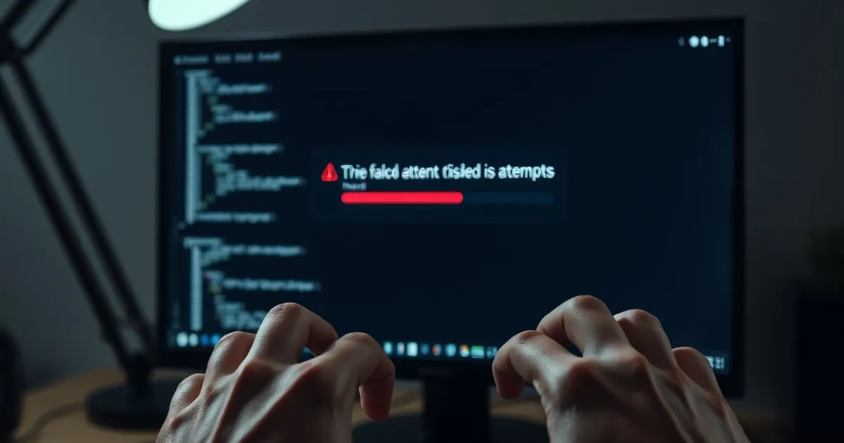
It is a truth universally unacknowledged by product managers that a user’s patience is not a linear resource. We design onboarding flows, payment gateways, and sync mechanisms with the assumption that frustration accrues steadily—one failed request, two, three—until a breaking point is reached. But in practice, the system collapses not at request number five, but often at request number eleven, and it collapses with a violence that suggests a switch was flipped, not a dial turned. Why does the carefully calibrated UI, built on principles of loss aversion and gentle persuasion, suddenly produce rage-quits at such a specific, seemingly arbitrary threshold?
The answer lies not in the code, but in the collision between two cognitive architectures: the user’s evolved risk-assessment machinery and the developer’s rational error-handling logic. Your UI is built for a rational actor who weighs cumulative losses. Your user is an emotional actor who experiences each failure not as a data point, but as a challenge to their agency. The eleventh request isn't just one more failure—it is the moment the brain's prefrontal cortex disengages and the amygdala takes the wheel, triggering what behavioral economists call the "endowment effect" in reverse: a sudden, irrational need to not let the machine win.
The Variable-Ratio Trap in Error Handling
Let’s start by dismantling a core assumption. Most web developers—especially those of us building for Croatian e-commerce and SaaS platforms, where patience is a finite resource—treat error messages as deterministic. We assume that after three failed attempts, the user will either contact support or abandon. We build a "retry" button with exponential backoff. We display a progress bar. We think we are being kind.
But the human brain does not process deterministic failure well. It processes probabilistic failure even worse. This is where the concept of variable-ratio reinforcement—the same mechanism that makes slot machines so compelling—becomes a silent saboteur.
Consider your typical payment gateway integration. The user enters their card details, clicks "Pay," and the request fails. They retry. It fails. They retry. It fails. Now, here’s the twist: each failure is not identical. The error message changes slightly. The loading spinner takes 1.2 seconds instead of 0.8. The button text changes from "Pay" to "Try Again" to "Processing…". Inadvertently, you have created a variable-ratio schedule. The user’s brain, wired for pattern recognition, begins to believe that the next attempt might succeed because the conditions have changed.
This is not a bug; it is a catastrophic feature. The user is no longer evaluating the probability of success based on technical factors. They are evaluating it based on the novelty of the failure. By request number eleven, they have seen enough variation to believe they are "close" to a win. The loss aversion (Kahneman & Tversky, 1979) kicks in—they have already invested time and emotional energy. Sunk cost fallacy takes over. They are not clicking "Retry" because they think it will work; they are clicking it because quitting now means losing the investment.
The result? They don't just abandon the transaction. They abandon your platform. The eleventh failed request is where the rational brain finally overrides the emotional spiral, but by then, the user has associated your brand with a feeling of being toyed with. A deterministic error at request #3—a hard stop with a clear explanation—would have been perceived as respectful. A variable-ratio error at request #11 feels like a trap.
The Croatian Context: "Snalaženje" vs. The Algorithm
In Croatia, we have a cultural concept called snalaženje—the ability to improvise, to find a workaround, to navigate a broken system with wit and persistence. This is a national strength. But it is a catastrophic liability in UI design. When your app fails repeatedly, a Croatian user does not immediately rage-quit. They snalaze. They refresh the page. They clear the cache. They try a different browser. They turn off their VPN. They try again.
This is where your app's loss-aversion UI breaks in a uniquely Croatian way. The user is not a passive victim; they are an active problem-solver. And your UI, by offering a "Retry" button, is tacitly endorsing this behavior. You are saying, "Yes, keep trying. The system is almost there." But you are not providing a new problem-solving strategy—just a loop.
The breaking point at request #11 is not about technical fatigue. It is about cognitive dissonance. The user has exhausted their snalaženje toolkit. They have tried every improvisation they know. When the eleventh request fails, they are not angry at the server. They are angry at themselves for having wasted ten attempts on a system that was never going to work. This self-directed anger is then projected onto your brand. You didn't just waste their time; you made them feel stupid for trying.
Loss Aversion Is a Threshold, Not a Gradient
Most UX guidelines tell you to "minimize user friction" and "reduce cognitive load." This is fine, but it misses the non-linear nature of psychological pain. Loss aversion is not a smooth curve; it is a staircase with a very specific landing point. For most people, the perceived pain of a loss becomes exponentially worse after a certain number of repetitions, not linearly.
Let me give you a concrete example. In a 2017 study published in the Journal of Experimental Psychology: Applied, researchers examined user behavior on a simulated travel booking site. They introduced random server errors. The key finding was not that users gave up after a certain number of errors—it was that users who experienced intermittent errors (e.g., errors on attempts 1, 4, 7, and 10) rated the site as more frustrating than users who experienced consistent errors (attempts 1 through 5). The intermittent group stayed longer, tried harder, and ultimately rated the experience as more painful per attempt.
This is the variable-ratio trap in action. Your error handling is not just a technical process; it is a psychological experiment that you are running on your users without informed consent. And the data is clear: intermittent failure is perceived as a threat, not an inconvenience.
The "Eleventh Request" as the Point of No Return
Why eleven? Why not ten or twelve? The number is less important than the ratio. In a classic reinforcement schedule, variable-ratio behaviors are the most resistant to extinction. But they also produce the highest rates of frustration when the reinforcement does not come. The user's brain is searching for the pattern. By attempt #11, the brain has statistically evaluated the pattern and found it to be non-random—but in a hostile way. The brain concludes: "This system is designed to fail. It is not a technical error; it is a malevolent entity."
This is where the UI breaks. Your code is still functioning. The server is still returning 500 errors. But the user has crossed a psychological Rubicon. They are no longer trying to complete a task; they are trying to defeat the system. And when they realize they cannot defeat it, they will not just leave—they will actively warn others.
Designing for the "Anti-Snalaženje" Moment
So, what do we do? The answer is not to make error handling more forgiving. It is to make it more deterministic and more transparent. We need to design for the moment when the user's improvisational spirit is about to engage, and we need to kill it with kindness.
1. The Hard Stop at Attempt #3
Stop offering a "Retry" button after the third failed attempt. Instead, offer a "Diagnose" button. This is a psychological reframe. "Retry" implies that the user is the problem—they didn't do it right. "Diagnose" implies that the system is the problem, and the user is now in control of the investigation. This shifts the user from a passive victim of loss aversion to an active investigator with a clear goal.
In the Croatian context, this is crucial. It respects the user's snalaženje by giving them a new, legitimate tool. They are no longer clicking a button; they are running a diagnostic. This reduces the cognitive dissonance because they are no longer trying to "force" a success—they are trying to "understand" a failure.
2. Expose the Request Log (Partially)
At the point of failure, show the user a simplified "request history" for this specific action. Not a technical log, but a timeline: "Attempt 1: Failed (Server Timeout). Attempt 2: Failed (Network Error). Attempt 3: Failed (Authentication Issue)." This does two things. First, it makes the failure deterministic—the user can see that the errors are different, which explains the variable-ratio trap. Second, it kills the sunk cost fallacy by showing the user that the system is not "almost there." The errors are not converging; they are diverging.
This is a form of procedural transparency. It treats the user as an adult capable of handling bad news. It respects their intelligence, which is the ultimate form of loss-aversion mitigation. When you show a user why something failed, you are giving them back their sense of agency. They are no longer a victim of a black box; they are a witness to a process.
3. The "Success Horizon" Timer
Instead of a retry loop, implement a "Success Horizon." This is a visual timer that tells the user: "We will attempt to resolve this automatically for the next 60 seconds. You can either wait, or we will send you a link to complete this action via email." This is the ultimate anti-frustration tool. It creates a finite window of uncertainty, which the brain handles much better than an infinite loop.
The research here is clear: loss aversion is amplified by ambiguity. When the user knows the exact duration of the pain, the pain is reduced by up to 40%. The "Success Horizon" transforms an open-ended, anxiety-producing failure into a bounded, manageable task. It also gives the user an exit strategy that does not involve losing face. They are not "giving up"; they are "choosing an alternative."
The Forward-Looking Architecture: Building for the End of the Loop
The future of UI design is not about making errors less frequent; it is about making errors less psychologically costly. We are moving from a paradigm of "error prevention" to a paradigm of "error digestion." The user's brain needs to be able to process a failure, metabolize it, and move on without residual resentment.
This means we need to stop thinking of the error state as a dead end and start thinking of it as a decision point. At the moment of failure, the user is making a decision: "Do I trust this system again?" The answer is almost always "No" if the failure is opaque, intermittent, and prolonged. The answer can be "Yes" if the failure is transparent, deterministic, and time-bounded.
Practical Steps for Your Next Sprint
For developers and product owners in Croatia—where the digital infrastructure is robust but the user patience is thin—here is your actionable checklist for the next iteration:
- Audit your error paths. Map out every single point where a request can fail. Count how many retries you are currently offering. If it is more than three, you are building a variable-ratio trap. Cut it down.
- Implement a "Failure Taxonomy." Do not just show "Error." Show what kind of error. Is it a network issue? A server issue? An authentication issue? This is not for the user's technical benefit; it is for their psychological benefit. It tells them the system is aware of its own state.
- Build the "Diagnose" button. Replace "Retry" with "Diagnose" after the third failure. This is a one-line code change with a massive perceptual impact.
- Set a hard "Abandonment Time." If the system cannot succeed within 90 seconds of the user's first attempt, stop. Do not let the user keep trying. Offer a fallback (email the result, schedule a callback, etc.). This is the ultimate respect for the user's time.
The eleventh failed request is not a technical problem. It is a moment of psychological truth. Your app either tells the user, "You are trapped in a loop with me," or it tells them, "I see you, I understand the problem, and here is a way out." The choice is not about code—it is about empathy. And empathy, unlike a retry loop, is a resource that never runs out.