June 2026
Why Your Web App’s Reward Loop Mimics a Slot Machine’s Feedback Cycle
Discover why your web app’s reward loop mirrors a slot machine’s feedback cycle—and how to design ethically
The psychological pull you feel when a notification badge appears, or when a progress bar inches toward completion, is not an accident. It is a carefully engineered feedback loop, and its core mechanics are identical to those found in the most addictive devices of the last century. The question every web developer and product designer in Croatia must confront is not whether these loops work, but whether you are building a tool or a trap.
The Architecture of Anticipation: Variable-Ratio Reinforcement in Code
The most powerful psychological lever in digital design is not the promise of a reward, but the uncertainty of when it will arrive. This is the principle of variable-ratio reinforcement, first rigorously documented by B.F. Skinner in the 1950s. Skinner discovered that rats pressing a lever that delivered a food pellet on an unpredictable schedule would press the lever far more persistently than rats who received a pellet every single time. The unpredictable schedule created a behavior that was resistant to extinction.
Your web app, whether it is a project management tool, a social feed, or a gamified learning platform, employs this same mechanism. The "reward" is a like, a comment, a new follower, or a completed task. The "lever" is a refresh, a scroll, or a tap. When the reward arrives on a predictable schedule—for example, a notification every time someone comments—the user habituates. The dopamine response diminishes. But when the reward is intermittent, arriving after two comments, then five, then one, the brain remains in a state of heightened anticipation. The nucleus accumbens, a key region in the brain's reward circuitry, fires not when the reward is received, but in the expectation of it.
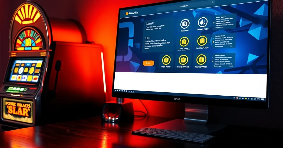
Consider the design of a typical pull-to-refresh mechanism on a social media feed. The user pulls down, the spinner animates, and then—silence. Or a new post appears. Or three posts. The timing and content are variable. This is not a bug; it is a feature of the architecture. The developer has replicated the exact contingency schedule that keeps a person pulling the lever on a one-armed bandit. The only difference is the currency: time and attention instead of coins.
The "Near Miss" as a Design Pattern
A specific subset of variable-ratio reinforcement is the near miss. In classic slot machine studies, a near miss—two cherries and a third that almost lines up—is psychologically more motivating than a complete loss. The brain interprets it as evidence that a win is "coming soon." This principle is now embedded in many web app UX patterns.
Think of the "almost perfect" score in a quiz app, or the "you were this close" message in a fitness tracker. In a web development context, consider a form validation that highlights a single error after a user has completed 95% of a multi-step process. The user experiences a spike of frustration, but also a surge of motivation to correct the one error and complete the task. The near miss converts a potential drop-off into a re-engagement.
Loss Aversion and the Cost of Abandonment
Daniel Kahneman and Amos Tversky's prospect theory gives us another lens. Loss aversion states that the psychological pain of losing something is roughly twice as powerful as the pleasure of gaining the same thing. In web app design, this translates directly to the user's perceived investment.
Every moment a user spends filling out a profile, curating a playlist, or building a project board is a sunk cost. The more they invest, the more painful it becomes to walk away. This is why onboarding flows that ask for significant data upfront are effective, but also ethically fraught. You are building a psychological lock-in based on the fear of losing what has already been contributed.
A concrete example: the "streak" feature in language learning apps like Duolingo. The user builds a streak of consecutive days. The reward for maintaining it is a variable boost of in-app currency or a visual badge. But the real power is loss aversion. The user knows that missing a single day will reset the counter to zero. The fear of losing that accumulated progress—of watching the flame icon extinguish—is a far stronger motivator than the joy of gaining a new badge. The app has created a situation where the user's rational calculation of "should I study today?" is overwritten by an emotional need to avoid a loss.
Designing for the Sunk Cost Fallacy
This principle is not limited to streaks. Any feature that accumulates user data, history, or social capital creates a barrier to exit. A project management tool that stores five years of task history, or a social network with 2,000 connections, becomes increasingly difficult to leave not because of technical lock-in, but because of psychological lock-in. The user has invested so much that the cognitive cost of starting over feels insurmountable.
For a Croatian developer building a local service—perhaps a community marketplace for Istrian olive oil or a booking platform for Dalmatian island villas—this has direct implications. If you can design a system where users build a "reputation" or a "collection" over time, you are leveraging loss aversion. The user will return not because your tool is the best, but because leaving feels like losing part of their digital identity.
The Feedback Loop of Progress: Why Loading Bars Work
Not all reward loops rely on uncertainty. Some of the most effective are based on the illusion of progress. The classic study by Teresa Amabile and Steven Kramer, published in The Progress Principle, showed that a sense of forward momentum is the single most powerful motivator for knowledge workers. In a web app, this translates to visual progress indicators.
Consider a multi-step checkout form. A simple progress bar showing "Step 2 of 4" does more than inform the user of their location. It creates a psychological commitment to completion. The user has already invested in steps one and two; the bar visually represents the sunk cost. The closer the bar gets to the end, the more the user's motivation shifts from "should I buy this?" to "I need to finish this process."
This is the same mechanism that makes a slot machine's spin animation so compelling. The reels spin, the symbols flash, the machine plays a tune—all while the outcome is determined. The user is not just waiting for a result; they are being carried along a narrative of impending resolution. The progress bar is your app's spin animation.
The Dark Side of the "Infinite Scroll"
The infinite scroll is a masterclass in removing termination cues. A slot machine has a clear stop point: the reels stop spinning, and you either win or lose. A traditional webpage had a bottom. The infinite scroll has neither. It exploits a behavioral phenomenon called the "goal gradient effect"—the observation that people work faster and harder as they approach a goal. But with infinite scroll, the goal is perpetually deferred.
The user scrolls, expecting a reward (interesting content) at any moment. Each new batch of posts is a variable-ratio reinforcement. The app has removed the natural stopping point, turning a browsing session into a near-endless loop. For a news site or a social feed, this increases page views and ad impressions. For a productivity app, it is a disaster. The same mechanism that keeps a person reading news keeps them from finishing their actual work.
A Concrete Study: The 2014 Facebook Emotional Contagion Experiment
To understand the real-world power of these feedback cycles, one need look no further than the 2014 study published in the Proceedings of the National Academy of Sciences by researchers from Facebook, Cornell, and UC San Francisco. The study manipulated the emotional content of News Feed posts for nearly 700,000 users. The results showed that reducing the number of positive posts in a user's feed led to a measurable decrease in the positivity of their own posts. Reducing negative posts had the opposite effect.
The ethical controversy aside, the study demonstrates a fundamental truth: the feedback loop of a web app is not a neutral delivery mechanism. It actively shapes user behavior and emotional state. The algorithm that decides which post appears next is not just serving content; it is conditioning the user's response. The variable-ratio schedule of "what will I see next?" is being tuned, in real-time, to maximize engagement.
For a developer in Croatia, this is a critical insight. If you are building a local community platform, say for hiking trails in Plitvice Lakes or for sharing recipes from Dalmatian cuisine, your algorithm is not just organizing information. It is creating a psychological environment. The decision to prioritize "most liked" posts over "most recent" or "most diverse" is a decision about which feedback loop to amplify.
The Dopamine Loop in Micro-Interactions
The feedback cycle is not limited to major features. It is embedded in micro-interactions. The "like" button itself is a variable-ratio reward. The user posts a photo. They refresh. They receive a like. They refresh again. Nothing. They refresh a third time. Two likes. The unpredictability of the social validation is what makes the behavior compulsive.
Consider the design of a simple "toast" notification. It appears, it fades, it is gone. But the timing of its appearance is crucial. If a notification appears immediately after an action, it reinforces that specific action. If it appears randomly, it creates a sense of ambient possibility. The user keeps the app open, waiting for the next ping.
A Forward-Looking Close: Designing for Agency, Not Addiction
The research is clear: the tools we use to build engaging web apps are the same tools used to build addictive ones. The difference lies not in the code, but in the intent. As the web development community in Croatia continues to grow—building tools for tourism, agriculture, education, and local commerce—the ethical design question becomes paramount.
The practical path forward is not to abandon reward loops, but to redesign them for user agency. This means:
Introduce termination cues. Give the user a clear moment of completion. A progress bar that reaches 100% and then stops. A feed that says "You're all caught up." A task list that shows a celebration when all items are checked. The goal is not to keep the user in the loop, but to let them exit with a sense of accomplishment.
Make the reward transparent. Instead of a variable-ratio schedule that hides the pattern, show the user the logic. "You have 3 new notifications because 3 people commented on your post in the last hour." This reduces the mystery and the compulsive checking.
Build for the "end state." Think about what a successful session looks like for the user, not just for your metrics. If you are building a booking platform for apartments on Hvar, a successful session ends with a confirmed reservation, not with the user endlessly scrolling through listings. Design your feedback loop to accelerate that end state, not to delay it.
Test for compulsive use, not just engagement. In your A/B testing, measure not just time-on-site, but also the user's subjective sense of control. Ask them: "Did you feel like you chose to leave, or were you pulled away?" A high engagement score that correlates with a low sense of agency is a red flag.
The slot machine's feedback cycle is a proven psychological tool. It is not inherently evil, but it is inherently powerful. The question for every developer in Croatia is whether you will use that power to build a tool that respects the user's time and autonomy, or a machine that keeps them pulling the lever long after they have forgotten why they started.
The research gives you the blueprint. The choice is yours.